Color, Nature, and Design
Biophilia or the love of nature, is the concept that humans are innately attracted to nature. And as such are drawn to all things in the natural world. It follows then that incorporating a biophilic-focused design strategy in model homes can be quite effective in improving sales. Further, studies show that incorporating nature into designs can help potential buyers feel a myriad of benefits. Reduced stress, enhanced creativity, and clarity of thought are just a few of the purported benefits. The six principles of biophilic design include incorporating the following:
- Environmental features
- Natural shapes and forms
- Natural patterns and processes
- Light and space
- Place-based relationships
- Evolved human-nature relationships
This blog will focus on our designer’s use of color as a visual connection to biophilic design’s basic principles. We will explain how our designers incorporate the use of color to help emphasize the six biophilic design principles and the associated benefits.
Colors from Nature and their Impact
Nature’s color palate is an incredibly powerful design tool. Color can help enhance home sales, and improve mood, productivity, and ambiance of a space. And when used properly, color can also conjure the same feelings that nature does: color can put the biophilic design principles into practice. Our designers understand this unique power of color and use it in their designs strategically. For example:
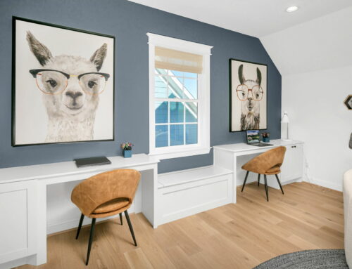
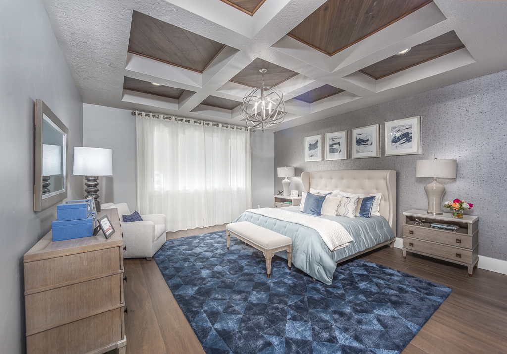
Blue shades often make people think of blue skies or clear water. As a result, our designers will use blue tones to create a calming experience within a bedroom.
Regal Homes, UT
Conversely, yellow tends to be a polarizing color as many people love it, while others avoid it at all costs. However, with the right intensity, hue, and saturation, yellow can remind us of the sun’s warmth, arouse feelings of happiness, and improve optimism. Yet, if overused, it can have an unpleasant or even disturbing effect. Sort of like the sun: too much and you can get a sunburn. Not enough sun and things begin to wither and die. However, the right amount of sun can make you feel just wonderful.
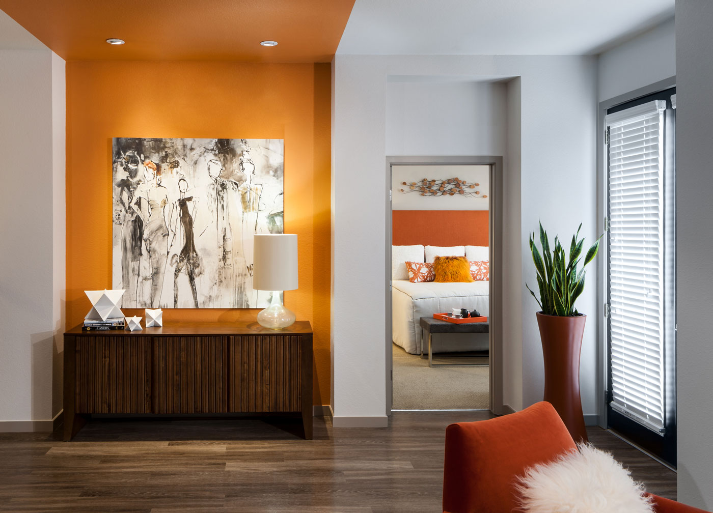
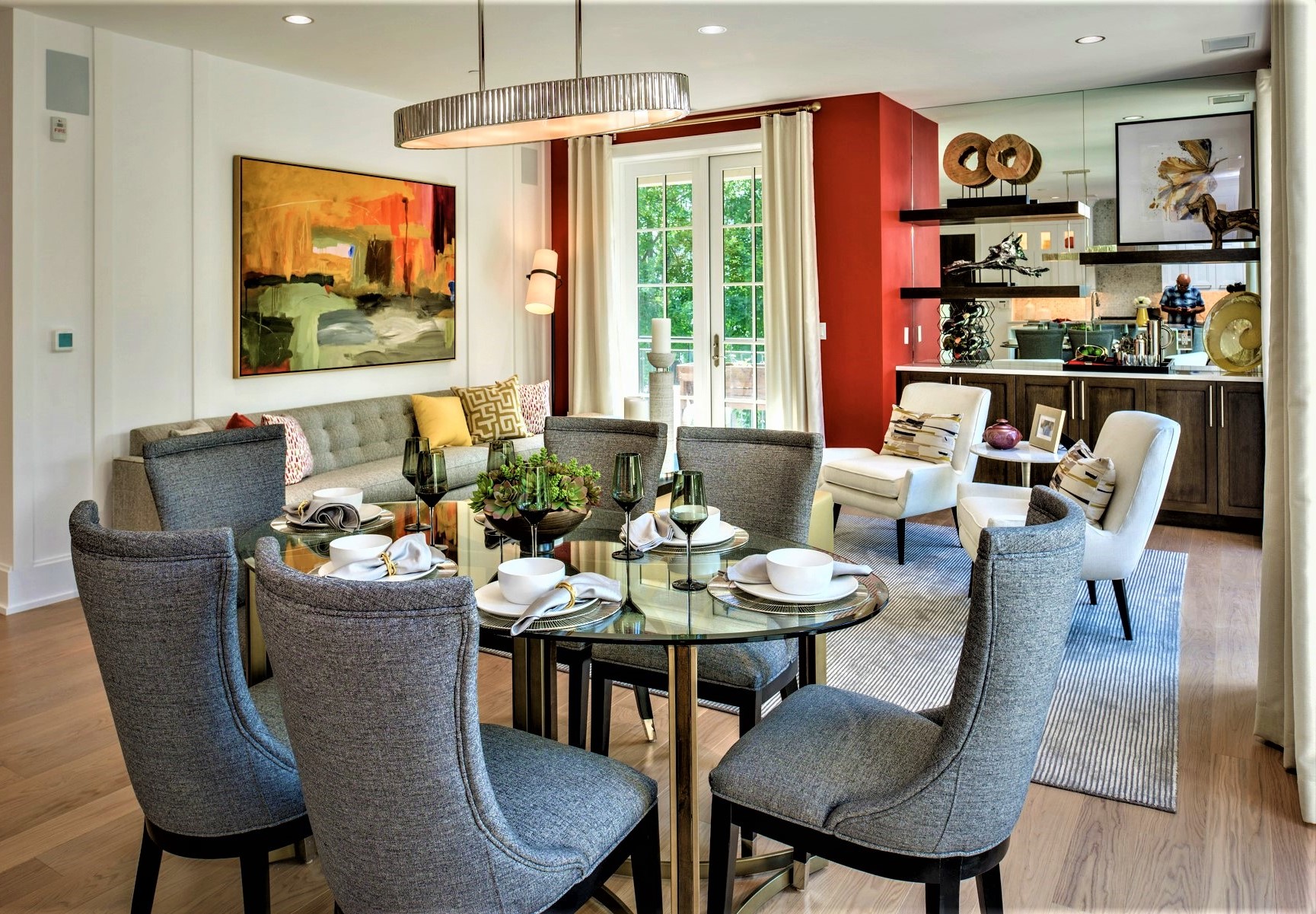
Similarly, reds are best used as an accent color as too much can be overpowering. While red is a stimulating color and has shown to help people make decisions, too much can overwhelm and possibly irritate. Conversely when used well, it can feel exciting and even a little dramatic. Additionally, reds often invoke the feeling of summer (think cherries and/or berries). Not to mention changing leaves and colorful fall foliage.
Gateway Development Group, Villa BXV
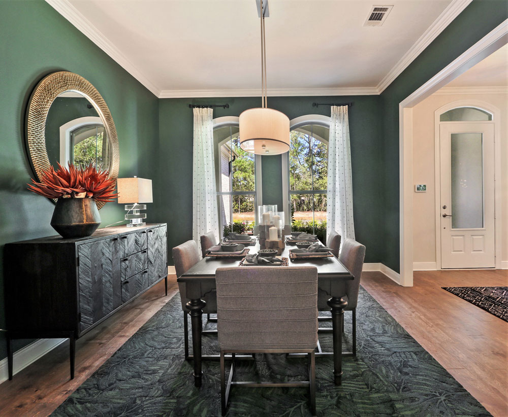
Shades of green are associated with vegetation and the outdoors.
Sunrise Homes, Pearl River, LA
Some effective ways our designers use green to bring the outdoors inside is by creating green accent walls, moss art, and other green shades that mimic the natural world.

Forum, Kent Place, Denver
We are all attracted to our planet’s beauty whether we are conscious of it or not. Our designers understand this and know how to use color to help evoke our positive feelings for and towards nature. For more on how we can help your model homes use color to take biophilic designs from principle to practice, please contact us today. And be sure to follow us on Instagram to see our biophilic inspired designs in action.