According to paint experts, the trending colors for 2023 are all about creating a comforting home. Industry experts have made their picks for the upcoming year, and the palette is full of rich and restorative colors tinged with natural warmth. From classic neutrals to earth tones to vintage-inspired hues, each color in the collection has the ability to envelop a room like a comforting embrace.
Soft Golds
These colors are earthy and neutral. The warm but gentle golds will introduce a more organic version of sparkly metallics. It resembles a desert landscape at sunset, and it will soften any aesthetic.
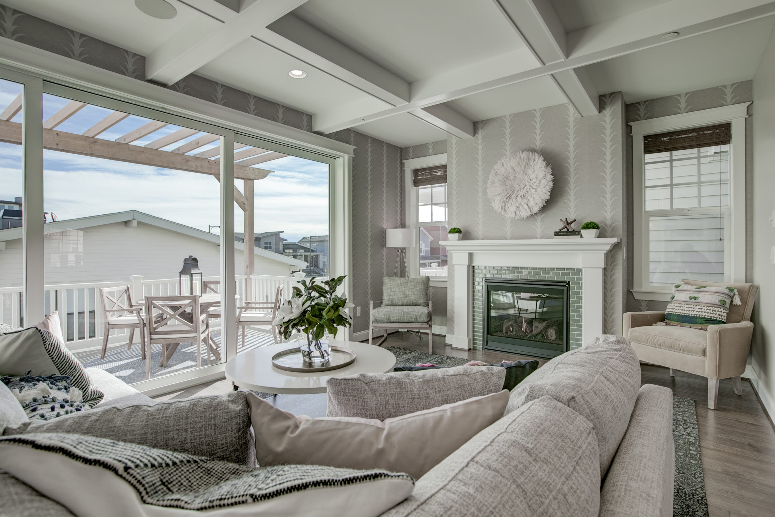
Outdoor Inspired
These hues are becoming gentler and easier on the eye. As green design grows, interiors are moving away from colors that feel too artificial. As a result, interiors flow seamlessly from and to their outer surroundings.
Breezy Blues
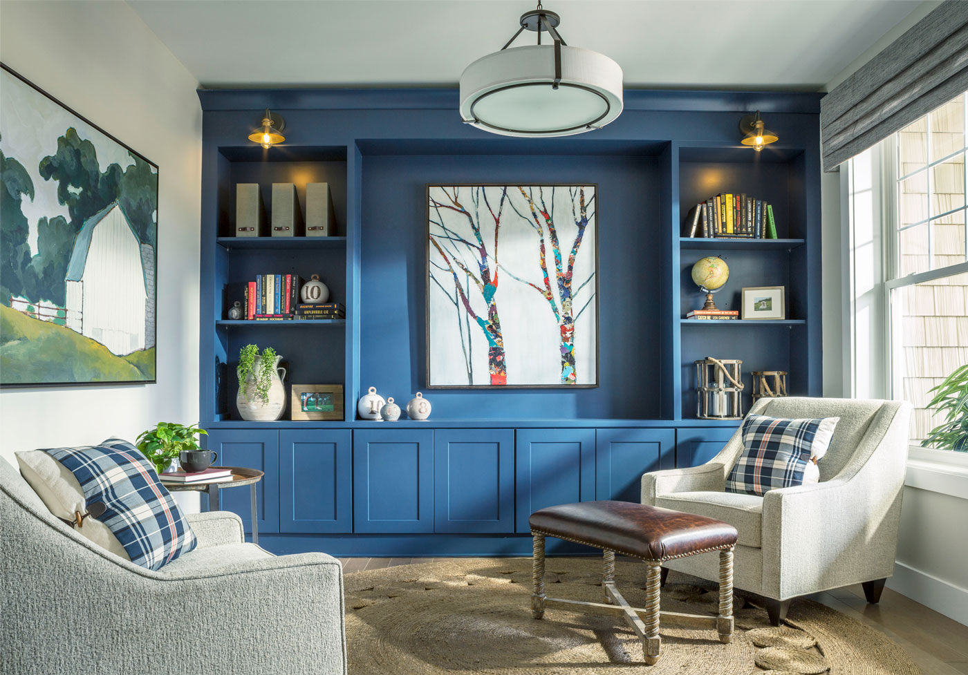
Soothing blues will make their way to the interiors. The relaxing nature of the cool tone makes it great for spaces of peace and calm. Studies, home offices, and meditation rooms are sure to make for a serene environment.
Tiered Monochrome
A monochromatic interior could be in any one hue. It can feature slightly different shades of the main color, while textures and shapes create a visually interesting space. Tiered monochrome generates a peaceful and steady atmosphere.
SHERWIN WILLIAMS WINS WITH CURATED COLOR PALETTES
Sherwin Williams has developed four distinct color palettes to encompass this year’s trend. The Terra Collection represents connection, whether with earth, our creative processes, ourselves, or our wildest dreams. The collections of forty colors span the spectrum of green and blue to brown, warmer neutral, and pops of yellows.
BIOME
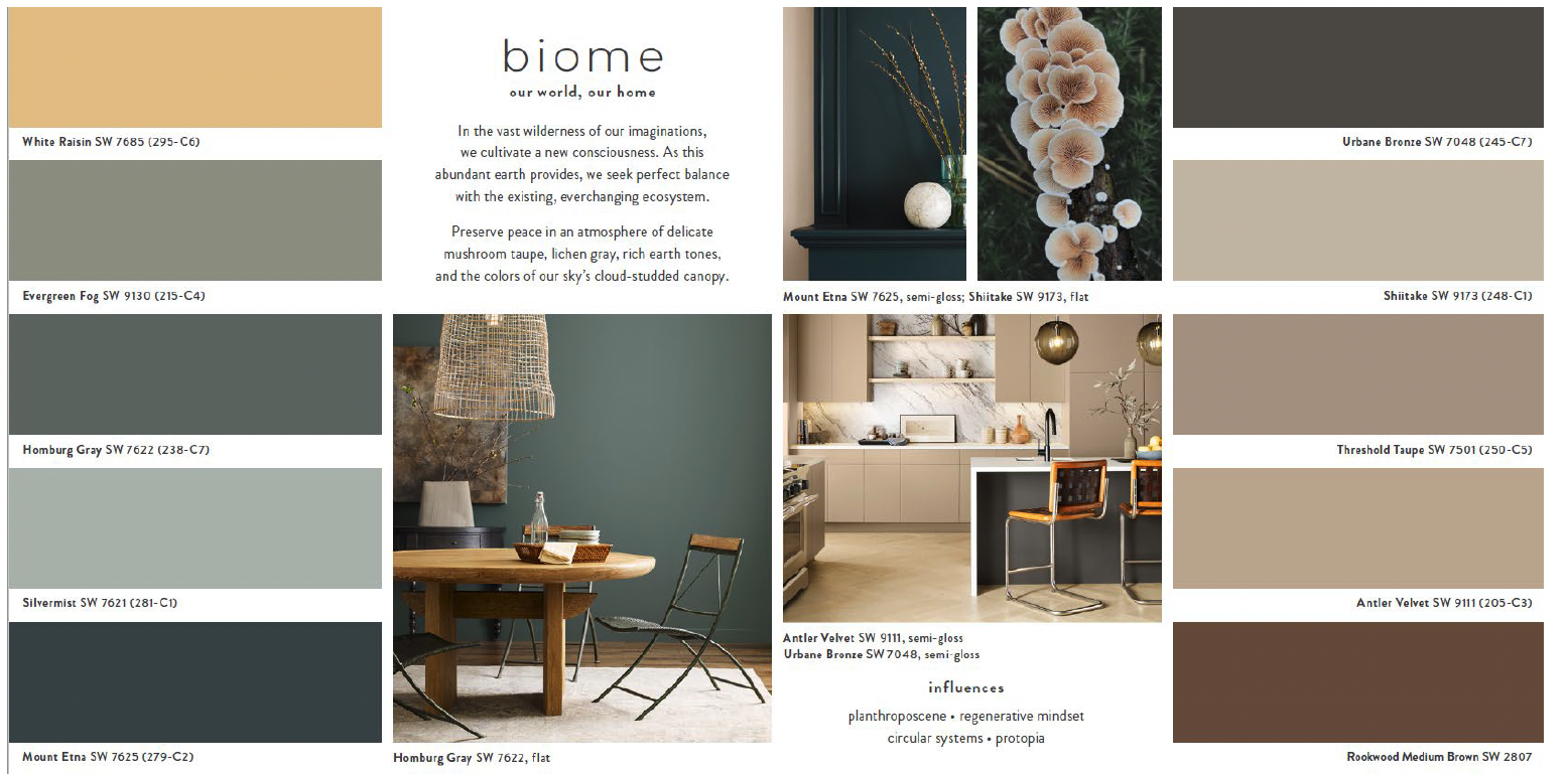
The Biome palette features the therapeutic nature of the outdoors. Bringing the outdoors in will continue. Biome’s crisp Homburg Gray and Mount Etna, a rich blue-green, are gorgeous alongside light or blonde wood-toned cabinets, while sandy neutrals like Shiitake and Rookwood Brown bring an authentic feel.
LORE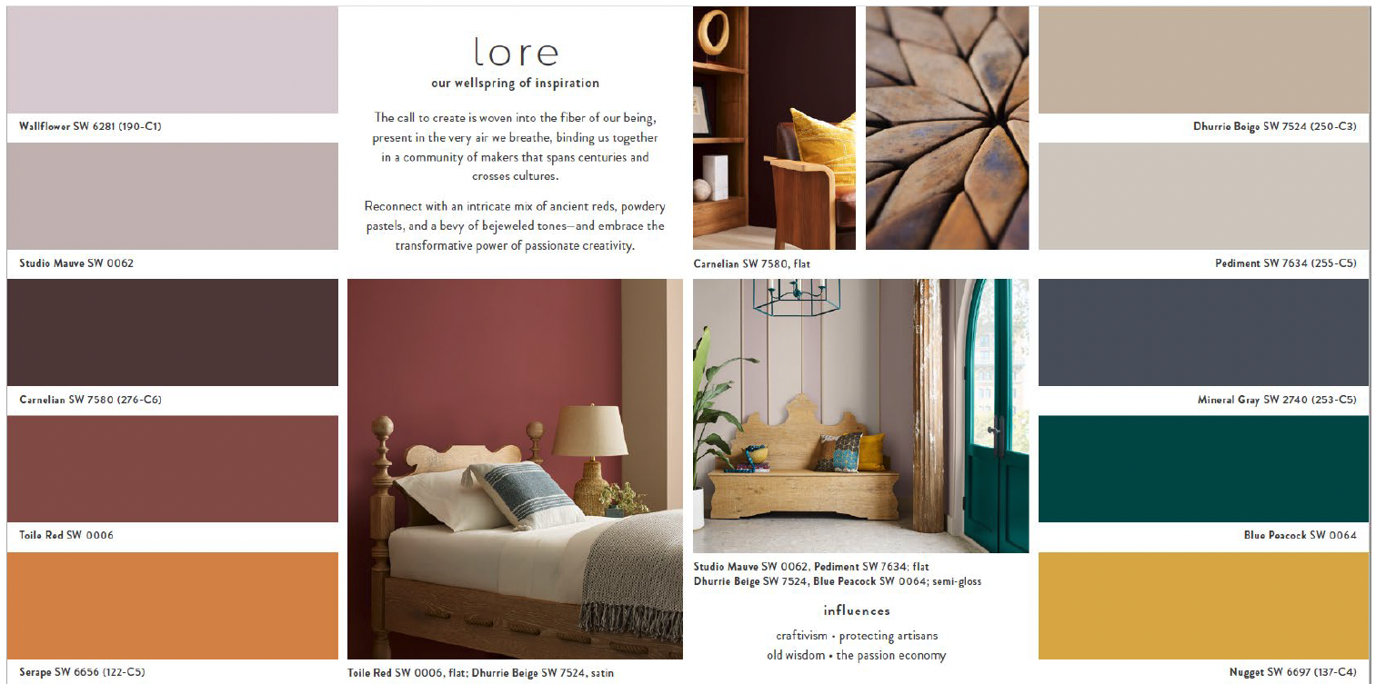
The Lore palette reflects a reverence for artisanal traditions, as well as the pandemic’s role in “creating this culture of craftivism where people are using craft to talk to each other and be good humans.” Neutral colors like Studio Mauve and Dhurrie Beige provide an additional sense of balance while proving that basics can sometimes be more than meets the eye.
NEXUS
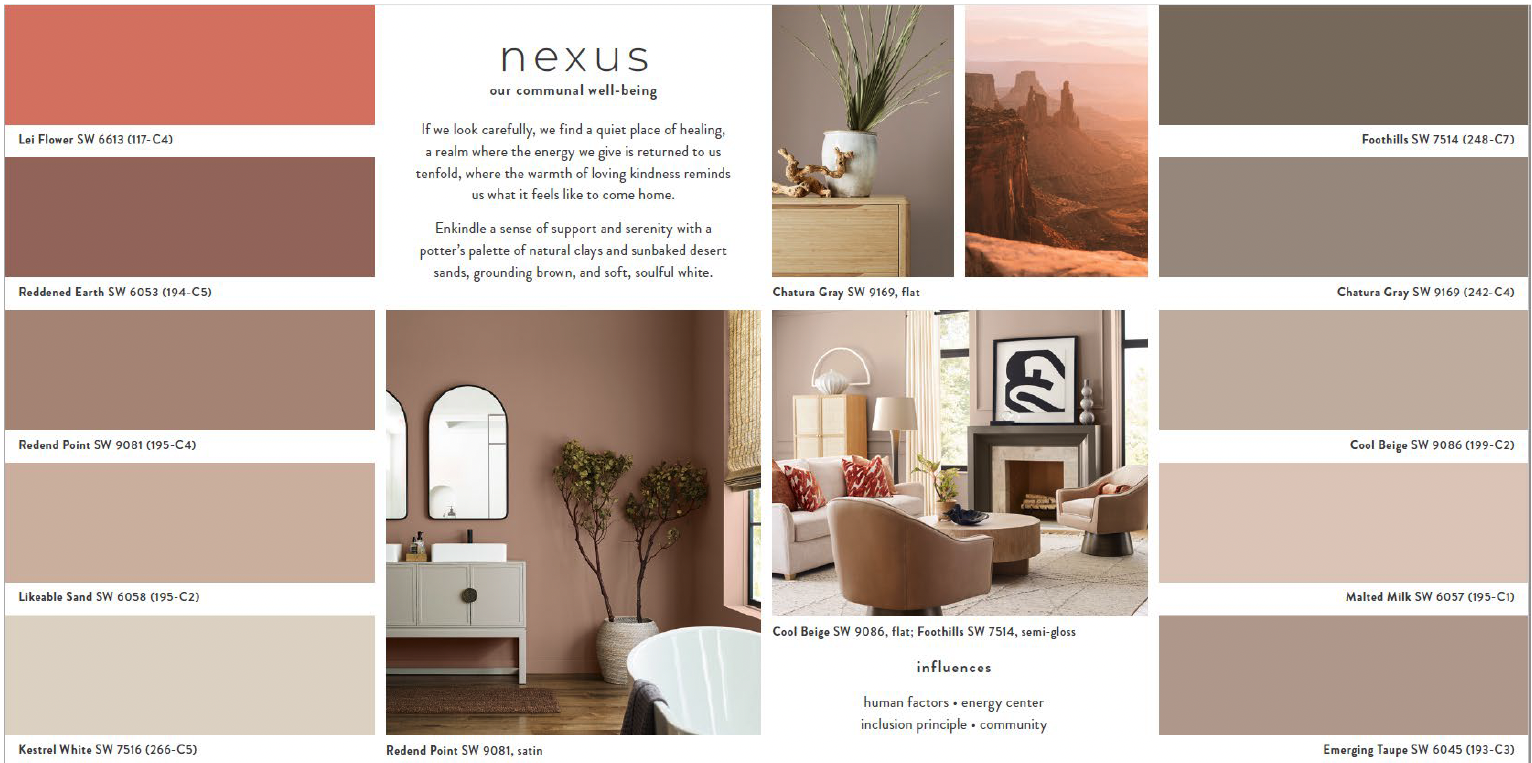
The Nexus collection is a serene palette that evokes the warm tones of a canyon sunset. Whether choosing the softness of Lei Flower or the gentle grace of Malted Milk, this earthy palette summons good energy for use in spaces where caring for ourselves and others is top of mind.
ORIGIN
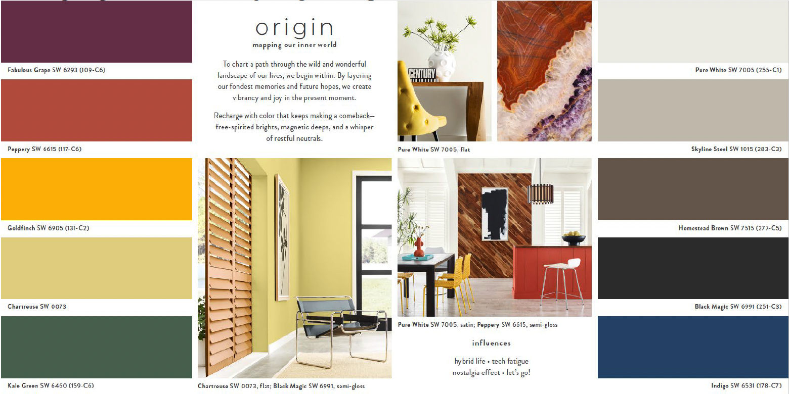
The Origin palette lets the imagination runs wild. A rainbow of nostalgia, Indigo, Peppery, and Goldfinch offer elevated twists on the three primary colors, while Kale Green, Fabulous Grape, and Chartreuse play supporting parts. When neutrals like Pure White or Skyline Steel are added in, the versatile, brilliant Origin can reenergize an environment.
We are excited to incorporate the latest color trends into our upcoming projects. Contact us for a color consultation! Looking for more inspiration? Visit our website and explore our project portfolio. We create award-winning designs for model homes, multifamily developments, clubhouses, sales & leasing offices, design centers, and amenity areas that help you sell more homes.